Monday 25 November 2013

Film Poster Ideas


Clare: Now that our trailer was complete, we started to note down ideas for the film poster which we had to create as part of our project. We decided to create a mind map to branch out certain elements in which we knew were essential to include in our main poster. These included things such as the main title, taglines, logotype, casting names and director, date release, age rating, any awards etc. However, the main element which we need to further in development is the main artwork and design of our poster, and in other words what is going to grab our audience in and influence our target audience (mainly girls between the ages of 12 and 16) to watch our film. This will be the next step in creating our movie poster.

Ade: 
We understand the significance of the minor nuances to reflect not only the genre of our film, but also the other themes that emerge. This is why we looked at other film trailers and other film posters to help us branch our ideas, which we thought appropriate to incorporate into a mind map. We became aware of how font sizes, colours and other aspects are important in making our appeal to our target audience. 

Amanda: 
We wanted to get a feel for general layouts of film posters. We didn't just look in the drama genre, we explored horror film posters, action, sci-fi and comedy. All posters more or less contained the same thing. But layout was varied on the genre. Horror posters had very large, over-powering photos, with small, distorted writing. Comedy had large writing, around the central picture. We want ours to be similar to the layout of a horror poster as we know the main focus is on the picture revealing a message. Comedy and sci-fi usually have posters that reveal more or less what happens in the film. We want to take on the effect of horror and be subtle and cause the audience confusion and yearn to find out more. 

Taglines

A Tagline is a slogan which creates a memorable phrase. They are commonly used in posters for films as they are interesting and make the audience want to find out more or see how it relates to the film, some of them can also sum up the film. They relate to the genre and what happens in the film.


Clare: ‘The Perks of Being  Wallflower’ film was inspired by the book, written by Stephen Chbosky. It is known as a coming of age teenage film, which follows the life of the protagonist Charlie through his letters that he writes in his Freshman year. The tagline is of a different font to the title but is the same for the actors names and the information that it is from a novel. I think this is a good idea as it makes the title stand on its own more and is therefore more of a focus than the tagline. However, it does keep to the colour scheme by being black like the rest of the colours, I like the use of colour for the titles as it contrasts well with the bright background of the wall, making me realise that for our film poster we should focus mainly on what colours will stand out more than what colours we personally want to use. What I also like about the tagline is that it fits perfectly in the background as it is in the frame of one of the bricks, the effect of this being that it blends well with the poster and therefore does not have more of an emphasis than the title. As for the actual words of the tagline, the quote “WE ARE INFINITE” is known famously among the audience that had already read the book before the film was released, which means the tagline is most likely trying to relate to a niche audience. However, the tagline also becomes a remarkable quote in the film, helping to develop the characters. Therefore, the poster is preparing the audience to watch the film.


Ade: 
Angus , thongs and perfect snogging is another example of a teen film that utilises a tagline. Its tagline is 'Georgia Nicholson is not going mental, but her life is angus, thongs and perfect snogging'. As this is a comedic film, the use of irony is appropriate and playful. The bright colours are also suitable for the poster and the different font sizes further enhances this playful, not-serious sort of feel. For our film poster, it may be useful to incorporate a sort of 'ironic' or play on words tagline. However, the bright colours and the multiple font sizes may not be appropriate for our poster because our film is more dramatic and sinister. However, we should use something creative and thought provoking but also memorable for our audience. 


Amanda: 

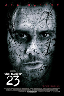
We like the effect of this poster. The tagline 'the truth will find you.' is very effective. The layout of this poster is great. The rick colour contrasting the background with Jim Carrey's face creates a focus on him. The lighting almost makes him look lifeless. The tagline is small, yet the harsh red colour makes it stand out. We don't like the monochrome theme, we would much rather have a blue/green colour to neutralise the poster and make it less horror themed. The tagline is short, punchy and draws people in. The poster doesn't reveal what the film is about, however reveals the genre, which again is what we want to achieve. The font is kept throughout the poster, and even in the credits of the film, which creates a professional feel.


Clare: 
We have come up with some taglines that can relate to our trailer and the theme of teen drama. These are as followed:


  • "A journey to regain her past"
  • "A journey took to regain her past"
  • "What took years to build, broke down in an instance"
  • "Follow her path, learn her story"

Film Poster Influences


Ade and Amanda: We looked at the posters of the films we found had a great influence on our trailer. The poster 'Cyberbully' is simple yet powerful. In the poster, we see 'Taylor' sitting alone, looking at her laptop, with words surrounding her. It shoes the fact she feels isolated and is getting cyber bullied. However, we don't like the background colour, because it is bright and does not create a sombre emotion if you look at it. The laptop is the only prop, yet seems to be more powerful than the actress sitting there. Even though the audience can't see what the laptop says, we all know it will be harsh comments on a social networking site. 


This poster for the film 'Bullying' is effective. Similar to other film posters, this one has a key figure who stands in the middle. This gives an insight into the character, isolated and alone. The poster also has a dark background effectively reflecting the grim, harsh storyline that may emerge within the film. The light at the end of the tunnel gives is ambiguous as it may symbolise a possible 'death' or suicide, though it may also mean that everything may be resolved and the light signifies good. The only flaw this film has is the character is too much of a dark figure and not exposed as much. It almost presents the film as an horror.  


We decided we don't like this poster for several reasons. There are too many people on the poster, drawing attention away from the main character. the film is about a young girl getting raped. However, from this poster is seems like the child is hiding from the two people above (who are actually her parents). The parents are portrayed to be evil in this poster. Saying this, we like the font used as it seems like a computer. 


Clare: This poster is effective as it displays a portrait of a character alone with their face taking up the majority of the cover, therefore we are aware they are the protagonist and it draws attention to the fact that they are an important character in this film. We liked the layout of this poster in particular because of the layering style with the writing all over the man's face. We thought that this would be a great idea to use for our own poster because we particularly liked the scribbled, messy element in which we could include hurtful bullying words such as 'stupid girl' etc. The lighting of the photograph is also effective here because of the black border which leads your eyes to the character's face and draws you into the image. However, this may look a bit too dark for our genre, so we could adjust the lighting level and make it a bit brighter to appeal to a younger audience and make clear of the genre. 

Production Logo: Finished


Clare: We initially had problems with the sizing of our logo after we had exported it as a Quick time file, as it was too small for our liking and had a huge black border which decreased the professional look of our trailer. As it is a huge aspect of our trailer, we knew it was essential to fix to give that enhancement.


Ade:
However, after exploring different
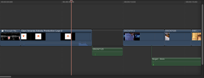
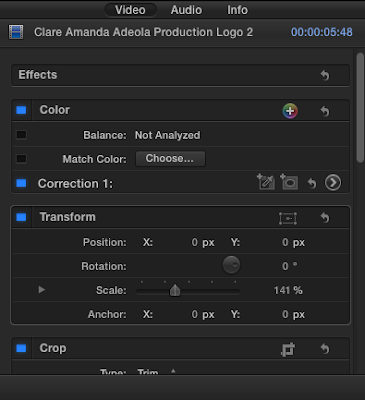
methods, for example we attempted to alter the properties on Motion, we couldn't resolve the sizing issue. We then realised that it could be enlarged in Final Cut Pro, by adjusting the scale under the 'transform' option. This quickly gave it the prominence we desired. This also meant that we could finally export our finished trailer and post it to YouTube. Seeing as our production company did not work with any other company on our trailer, we wanted to make sure our logo stands out. Our logo taking up the whole space on the screen creates our desired effect

Voiceover

Ade: Because many of our film trailer influences consist of voice-overs, we thought it would be highly relevant to incorporate this aspect into our trailer. Voice-overs tend to make trailers emotional, and sometimes provides an insight into what genre the film would be depending on the style of the voice.

Voice-overs also guide the audience throughout the trailer, keeping them attentive and prevents confusion within the audience. We used Amanda's voice within the trailer because she's the protagonist, as well as her councillor, Jane. This allows there to be a sort of 'call and response' ('question and answer') to occur which enables Anna to explain some of her feeling within the conversation.

However, as it is a trailer, we did understand that we had to articulately use voice-over so that we can keep the storyline ambiguous. Before the voice-overs were recorded we wrote out the dialogue we wanted both characters to say.

Below is the pre-written script for voice-overs.  We did not want our characters to simply rely on improvisation of words, so it was only proper to write a script for the voice overs.


Clare: We recorded the voice overs on my camera but then we later detached the audio from the scene and used only the audio. This is because when we attempted to record on the Mac computer during the lesson, there was too much background noise. We thought this could be removed using the adjustment selection, however it gave a strange 'underwater effect' and made the speech rather unclear and slurred. This is why we had to take the recording session to a quieter part of the school and film it there to then later transport the sound over.

Amanda: We know that voice-overs also make the trailer much more personal. It is almost as if the protagonist is directly talking to you (the audience). As Ade previously said, we used 'Jane's' voice to add in the response. This was also to change the tone and pitch during the trailer. We know that listening to the same person can be boring, so adding in another voice lessens the chance of that and also adds in an adults response. This also appeals to the more mature, elder females who could be our target audience. We mentioned old women (mums) would watch the film to learn about bullying and to look for signs to help their own children.

Final Music

Ade: 
In many trailers that we've previouly looked at or analysed, they tend to have a variation of music and intelligently use a range of dynamics to match the pace of the trailer. This is mainly so that the trailer doesn't get boring. Change of music also represents a change of mood/atmosphere.

In the 'Cyberbully' film trailer, it starts with a sort of fast paced sound without lyrics , so that the focus is based solely on her the protagonists happy lifestyle before there is a dramatic change. When the dramatic change occurs, the music alternates, it becomes slower in pace and the song consists of lyrics rather than merely piano or guitar music. This makes it more poignant and emotional. Throughout our trailer, this method was predominantly adopted. 'Cyberbully' has been a big influence in our coursework so we adopted this element to our trailer to ensure we created roughly the same effect with our trailer as ABC Family did with 'Cyberbully'.


The first song we used was zero by Segal. The instrumental is mainly a soft piano that has a sort of happy, slow pace and texture, and yet at the same time does not sound too romantic. The simplicity of the single piano allows the focus to be primarily upon the protagonist 'Anna' so that when the trailer changes and becomes more sinister, it makes it more dramatic and emotional so that the contrast between Anna's happy lifestyle and when 'everything changed' for Anna. 
Also, the music has been used in teenage programmes and films, for example, Skins. This is a drama based series and appeals to many teenage females. We know this music is successful in portraying the desired effects.


When the mood within the trailer changes and becomes more sinister. We also allowed a gradual change in music. We chose from our option the song 'I'll never forget you' by Birdy. This song is solemn and reflects what occurs within the storyline. The song consists of lyrics but not too much that it undermines what is happening within the scenes, but it compliments the scenes, evoking emotion and sympathy within the audience-which is what we desired. The song also helps out the credits as they fade in on the black screen; combined with the music, the credits are more dramatic and emotional.
Birdy's high pitched voice adds an element of femininity, even when Anna is in a hoodie and jeans. The high, long notes also present a child-like image, almost vulnerable. This is how Anna is portrayed when seeing the therapist and considering an overdose. The lyrics also fit in nicely with the idea of the trailer, and being forgotten.


Ade: There is a small section within the trailer where the pace increases and Anna's movements become more rigorous and harsh, e.g when she throws the books on the floor or screams the dialogue 'I don't need help!' we changed the dynamics, increasing the volume of the song to make it dramatic and reflect the harsh scenes within the trailer.


Clare: The music overall was a very important factor in our trailer as it was used to influence and evoke many emotions for our audience. These included emotions such as sadness, and feeling sympathy for our protagonist. Before we had added the music or soundtrack in, the trailer had no emotional element and felt very empty and boring. This goes to show how relevant it is and how high of a benefit it has in adding feeling to a final outcome.

Friday 22 November 2013

Making End Credits

Original Idea:


Improved/Faster Idea:


Clare: We originally thought to create our end titles in LiveType, however this was way too time consuming and since our deadline was approaching, we had to find another method. In Final Cut Pro it gave us the option to use pre-made title credits and adjust the text to our personal desire. It set out the end credits in a similar style to what we had previously planned e.g. it displayed the main people involved with the film such as the director and editor. We have decided to stick with this process because it is a lot more time-efficient and looks a lot more professional as we are using much more classy font as opposed to using the same one we used for our main title. Also, having a font for less important credits also shows the difference between the main credits shown on the clip. 
Amanda: Using a smaller and more concise font meant we could fit all of our desired credits onto the screen. in most trailers, the end screen credits are in a plain font like 'Arial' 

Tuesday 19 November 2013

End Credits

Clare: At the end of a trailer, it is very common that there is an end title/credits screen. This screen tells the audience the key dates and information in relation to the film. This can include the release date, websites and web addresses which will give them more info. They also typically contain the logos of the films' sponsors, distributors and production company, and the names of the main people that were involved with the film e.g. director, editors, cast.

Ade: Although each film differs in the way it presents its end credits/title, what they all have in common is their inclusiveness of production company logos and the producers and directors of the film. These are key features we intend to include in our end credit, though with alternations rather than merely duplicating the previous examples.

Amanda: We don't want our credits on the end title to be too big as we thought this to be too overpowering and intense. However, we want them big enough to read without having to squint. This can be difficult as there is a lot to cram into the credits screen. We like the idea of having the production companies and names in capitals, making them more important and stand out rather than words like 'starring' and 'in association with'.


Clare: We felt that in order for our film trailer to be as realistic as possible we should include an end title that would follow our main title and release date. In the actual trailer, we left absent some names of the actors that were actually within our trailer and only identified the prominent characters. This prompted us to want to highlight some of the other actors and the end title credits were a suitable way to acknowledge them without overcrowding our film trailer. Furthermore, we gained inspiration from other film trailers and searched on Google images for templates. The most helpful example template that we used is displayed to the right here and it includes all the main elements in which we wanted for our end credits. 


Clare: After looking over this template, we decided to draw out the design of our end titles on paper and write down all the names and logos that we wanted to include. I drew it out in the way that we wanted to physically create it, with the layout we desired. This previous plan would be helpful for when we came to actually making our end title either on LiveType or even Photoshop.

Ade: The above drawing gives us guidance before we embark onto the actual making of the end credits/titles. By pre-planning, we were able to be inclusive of all important aspects of it. For example, the the production company logo which is incredibly significant as it reinforces the impact of the production 'company' but also subtle nuances such as the directors etc. By associating the film with my previous production company 'GRIMESPINNER' it makes the film trailer seem more realistic, as most films tend to be in partnership with other companies to enhance the quality of their films and provide assistance in terms of equipments and funding. However, whilst my production company logo was made suitable for a grime, edgy, realism genre, it seemed contrast to the teenage drama genre that's evident within the storyline of our film 'Through My Eyes'.

Making the 12A Certification

Ade:

To make our film trailer more realistic, we thought it appropriate to incorporate a duplicate of 'The British Board Of Film Classification' certificate.This is a template of the BBFC certificate that we found on google. It has a 'This is to cerifty' statement and we planned to put our film title below it to make it suitable for our film trailer.We wanted a certificate 12 because our trailer doesn't have any swearing, weapons or severe violence. However, the potential drug use and pushing restricts us from a lower rating.


We used 'dafont' to find a suitable font for our title, which we intended to place onto the certificate. We used 'photoshop' to help make edit the writing so that it can conveniently be placed unto the certificate.


Amanda: This is the finished certificate. We used Photoshop to manipulate the certificate and put our own title unto it. it makes our trailer look more realistic and allows viewers to identify that our film is a British film and our production company is British. We also though that our film was suitable for the target audience of age 12. This is also evident within the certificate. We didn't want a bold font, because we wanted to show the target audience as mainly females, hence the font is soft and flows.

Background Noise Issues


Clare:


When filming the scenes with the psychiatrist talking in our school's isolation room, there was actually a school janitor cleaning and hoovering, creating very loud background noise which we particularly noticed when it came to editing. Since we wanted our audience to pay full attention to the dialogue and not be distracted by the background noise, we knew it was a necessity to find a way to remove it. We did some research on the internet until we found a Youtube tutorial which guided us to remove the irrelevant sound.

To overcome the sound issue, we detached the audio and then used the audio enhancement selection on Final Cut Pro which gave us the option to increase background noise removal. This made the speech a lot clearer in our clip and removed all the fuzzy, distracting noises. This tool is extremely useful, and we will keep using it for our other sound recordings to reduce any unwanted noise and give our trailer that professional feel. Background noise also defers attention away from the voice of the character. We think it's crucial for the main focus to be the voices so the audience know and understanding what they are saying.Amanda: with Fran Long (the therapist) we wanted it to sound loud and as if they were in an isolated room. We think the lack of sound achieved this successfully. 

Friday 15 November 2013

Editing Problems :-(

Clare: After adding some music in we replayed our trailer to observe it as a whole and look at in terms of what we still had left to add and improve on. However, we noticed that after several replays, we had a frame dropping error on the clips of Anna walking home and the time lapse. After researching this and finding out possible solutions, we realised it could be due to the high quality of the recording equipment we used, and therefore it wouldn't actually affect the rendered outcome of our trailer. Just to double check this, we imported our (still in progress) video to YouTube to see if it had affected the fluidity of our trailer. we discovered that this wasn't an issue and there were no random jumping notions within our exported version, so for now we think we should brush this issue aside and continue the editing progress! 
Amanda: Also, we later on discovered this was happening to another group in our class. knowing that this is a common issue that doesn't need to be resolved lightened our stress. We realised the speed of the time lapse could also be causing the clips to jump and glitch, so we slowed the time lapse clips down by a second. 

Thursday 14 November 2013

Making The Credits

Clare: 


As previously mentioned, we have now started our editing process and have therefore planned to create our narratives on LiveType in the same way I made our main title, in which the letters all enter individually, one after the other. In a similar process to creating the main title, I screen grabbed each individual letter from the 'dafont' website of our desired font 'Brain Flower.' I then reversed the colours so that the font was white and on a black background. After importing each individual letter onto LiveType, I adjusted the timings of each letter entrance (as displayed above in the screen grabs) so that they appeared one by one. I then continued this process for all of our narrative sentences, and it took a very long time as I had to keep editing each individual letter and make sure the timings correct. Despite this, I think it makes our trailer much more professional because of that uniform look it gives.

Ade: Although our film title 'Through My Eyes' emerges at the end with typing sound to reflect the aspect of bullying via a sort of social networking site 'cyber bullying, we decided to not incorporate this sound into the other titles such as 'a poignant journey'. This does not allow it the typing sound to clash with our background music and does not base the trailer solely on 'cyber-bullying' as there are other forms of bullying that are apparent within our film trailer. Also we thought the simplicity would make the trailer more emotional and doesn't confuse the audience. However, similar to the film title, the other titles fade in at a sustained pace.

Amanda:  The effect of our titles flowing in (excluding cast names over clips) represents the 'journey'. Just as our narrative tell 'a poignant journey' suggests the length Anna has to go to to get her old, happy, carefree life back, almost as if the credits are taking steps, just like she is. This is shown through her visiting a therapist. We wanted to keep the effect simple so the main focus would be on the emotion portrayed through the trailer. We knew, however, that if there was no effect on the credits, it would be boring and would not look professional. As Ade pointed out above, simplicity is the key. Simple effects to create lots of emotion is our goal, even though it's challenging. 

Editing The Trailer - Cutting Down and Casting Names!

Clare: We have begun the editing for our trailer now as we have completely finished our filming process! We have cut down all of our clips to the appropriate sizes and ordered them together in the right away. We have also began to sort out voice overs and are now attaching the main title and credits/narratives. 


Clare: The screen grabs above demonstrate the editing process of importing in our trailer sequence credits. We have decided to use the same font called 'Brain Flower' from dafont.com consistently throughout our trailer, to maintain a strict uniform and theme. We decided to put main actor names on top of certain clips as we did in our opening sequence last year, because it is a more appropriate way of displaying the important people rather than separating the clips and inserting them there which ruins the flow of the trailer. Above is an example of this. We are now moving onto narrative style credits which we plan to place in between certain clips later on. However, we will need to carry out this process using LiveType as we wish to make the credits appear in the style of our main title where the letters come in one by one in a typing style. We undertook this process before and it took a very long time as we had to transfer each letter  individually onto Photoshop and edit it on there prior to transporting to LiveType and making sure each letter was positioned correctly, which is why we am apprehensive about it, but we will have to see how it goes! Also, we kept the credits over the clips to keep a continuous flow throughout our trailer. We don't want people to get distracted from the storyline, with credits on a separate screen. Most trailers (like 'Cyberbully') who are building up to drama, and containing a voiceover, have credits on top of the clips, keeping the flow.

Ade: Although, we were aware that it would be a long process to edit each letter in Photoshop before making it appear in chronological order, however, we couldn't neglect this and we wanted it to look professional and synchronise with the scenes. Of course, to carry on continuity, we acknowledged that we had to keep the same font type throughout the trailer, this why we used the font 'brain flower' font from the 'dafont' website; we hope to continue using this font throughout our work. LiveType software was an important part of this process. We had all previously used it in our AS coursework's and knew that it would be incredibly useful when putting together our credits and finding useful and suitable effects when it appeared within our trailer. Although we have some credits on the scenes which are important cast names, we will have some credits on a plain black background as they are the narrative tells and are useful in informing the audience about our film, making it more dramatic and emotional. The credits will also, as well as being synchronised with our scenes it also has to go with the music that we intend to use. 

Thursday 7 November 2013

Creating The Main Title

Clare: To create the main title I used the programme 'LiveType'. I have had previous experience with this programme when creating my opening credits for my AS opening sequence. We chose the font from our previous selection, displayed on the 'Title Ideas' page. The font we chose was relevant as it stuck well to our 'school life' theme and was in a handwritten style, whilst also a unisex style. We wanted to display our main title a letter at a time, in sync with a type writing sound effect, again because it fitted in with the age generation and appealed to our target audience, similar to the title for the film 'Trust'. 


Overall, the process in creating our main title was quite tedious as it took many attempts to get right. Below are some screen shots from my editing process.


After editing each letter individually on Photoshop, I went onto LiveType and chose File, Place, to import each individual letter as a seperate layer. I then adjusted the layers so that each letter appeared one after the other as we wanted. Once I had put on each letter, I realised that the layout of our main title looked too bare and empty, so I considered ways of making it more interesting. I reconsidered our theme and thought of an idea to add a moving picture, in the style of a small doodle that teenagers sometimes do in class when they're bored. In our original storyboard, the first clip was going to be of Anna's eyes opening, but since we changed our idea and didn't use it, I thought it would be useful to draw some eyes shut and then open so that I could edit them and make them appear to open in a similar way. 


I took this idea on board and drew out a pair of eyes shut and then another pair open using a thick sharpie pen. I then continued to scan this drawing onto the Mac computer and open them in Photoshop. However, the first set of open eyes, I wasn't particularly happy with because of the way the light in the eye turned out. So I redrew this later on. On the other hand, I was moderately happy with the closed eye drawings so I kept them and rubbed away at excess parts of the image using the eraser tool.


Above is the new and improved open eyes that I drew, which I think were a lot better than my first attempt because they are without the huge circle in the pupil which looked a bit strange and hard to work out. 


After removing the white areas from where I had scanned the paper, I had the full outline of each drawing on a transparent background. This then allowed me to fill the outlined image in the colour white and transfer it to another canvas with a black background. This was necessary since the canvas on LiveType is also black and the font is white, so we wanted to keep to a strict, continuous theme throughout. I know had one set of closed eyes and another set of open eyes which I could place onto the LiveType programme and move to where I desired.


I placed in the closed set of eyes first in a new layer and set them next to each other. I then placed the open eyes in the same area of the canvas and adjusted it so it appeared immediately afterwards to create a flickering motion. 


The motion appeared as shown in the above screen shots. I think this motion image was a huge success and I am extremely pleased with the overall look of it. The next step in creating our title is to add the sound effects of the typing with each letter. This could be quite a long process as we have to find the sounds and adjust them to fit with the letter transitions. I may carry this action out using Final Cut Pro.


The final step I took in creating our main title was adding the sound effects. I downloaded a computer keyboard typing sound effect from Youtube, then imported it into Final Cut Pro alongside the title I had previously made on LiveType. I dragged in the sound effects and then zoomed in on the storyline element so that I could see it more closely and edit in greater detail. I then cropped, bladed and adjusted each typing sound alongside the transition of each letter in our title so that it all fitted together. 


Below is the final title that I created for our trailer.

Trailer Credits Layout


Amanda and Ade: Our favourite layout of trailers was 'Harry Potter and the Deathly Hallows part 2'.  This is because it included lots of narrative tells, which is what was want. The trailer also had a clear structure. However, it did not contain the actors' names. this is probably because everybody knows them anyway (Emma Watson, Rupert Grint). However, we want to include our actors' names so that the audience know who they are. 

We didn't like the credits for 'Cyberbully' and 'Despicable Me 2' because there were a lack of credits. Even though this didn't not let the audience get distracted, it left them with little knowledge as to who was acting and had little detail.