Showing posts with label Amanda. Show all posts

Friday, 31 January 2014

Final Trailer


Clare: Here is the completed and final version of our trailer 'Through My Eyes.' We made sure to make any final adjustments with sound and other elements before exporting our piece. We are really pleased with our end outcome since the 'drama genre' was not the easiest route to go down as opposed to horror which we did last year, so it was an interesting challenge for us. Feedback from the class and our teacher was also a success as they gave all positive comments and didn't request that we changed anything within our trailer. 

Amanda: We wanted to really challenge ourselves to portray one strong emotion, and make the audience feel this too. Showing several school peers and teachers, some of the feedback was:

  • 'I want to cry! I feel so bad for Anna.' - Iram Qureshi, 17
  • 'Wow, poor girl. I would hate that if it were me.' - Emma Williams, 17 
  • 'Good job. I love the shots, they really flow, especially the first two' - Liz Thompson, 52
It was comments like these that reassured us into knowing we successfully created what we wanted.

Adeola: What was most prominent in this film trailer was the subtle, but articulate alteration in music. The different sounds effectively reflected the scenes, the 'SEGAL' music was used for the montage to portray a sort of memory before we later change to the 'Birdy' soundtrack which effectively evoked emotion. The credits were also good, there was a continuity in font type to reflect the genre. 

Wednesday, 15 January 2014

Evaluation Question 4- How did you use new media technologies to in the construction and research, planning and evaluation stages?

How did you use new media technologies to in the construction and research, planning and evaluation stages?


Clare: Unfortunately my Prezi won't attach to this blog post, however, the link to my Prezi can be found here: http://prezi.com/oxxupsvmhhyq/research-and-planning/

Ade: Below, is the link to my prezi.
http://prezi.com/srbrodikbv16/?utm_campaign=share&utm_medium=copy

Amanda: My link to the evaluation prezi. 
http://prezi.com/lpykhdat7-po/use-of-media-technologies-in-our-evaluation/

Evaluation Question 3- What have you learned from your audience feedback?

What have you learned from your audience feedback?


Clare: For this question, we decided to interview our school peers, asking them questions about our poster and magazine cover in relation to audience. From our interviews, we found that the best element of our film poster was the general design, with the words scattered on our protagonist's face, as it "portrays what everyone else thinks of her" (Tarina). We also found that it would appeal to our target audience of 12-16 year old girls, due to the colours and fonts that we used. Adding to this, we also found it is relevant to the teen drama genre since we "get a sense of drama from the fonts/colours used" (Emma). To improve our poster, our peers suggested we reduce the amount of writing or maybe change the colour of the background. For the magazine cover, we found that the best feature was the design and editing with the eyes layered over the hands, also many of them commented on the fact it looked quite realistic due to the layout with the various story lines and magazine features. Next, we found all of them believed it was suitable for our target audience because it had taglines such as "UK's best teen magazine" and it included a Hunger Games poster, which is quite a popular teen film/book. Following from this, we found it was relevant to the teen drama genre as we didn't aim too high and portrayed drama through the style of the font we used, which was appropriate and eye-catching. Finally, to improve our magazine cover, many peers suggested that we change the name of our magazine from 'filmNOW' as it didn't immediately appear as a teen magazine, and may encourage parents to watch it more than teens. However, if a mum were to buy our magazine, it may mean that the younger ages within our target audience (i.e. 12-13 who don't have much independence to go to the cinema alone) would be taken to see our film by their parent and would therefore get to see it. Another aspect that we could have improved on our magazine were the colours, since our target audience is aimed at teens we could have included some more interesting, brighter colours, and maybe changed the background colour. The reason we didn't add a background colour before was because the fonts on the front were already many different bright colours, therefore we didn't want them to clash and appear unprofessional.


Clare: We then decided to use the green screen to demonstrate our audience feedback for our actual trailer, received from a survey we had previously placed onto our blog. The video above explains what we have gained from our survey and also includes some interesting bloopers at the end ;)

Year 8 Questionnaire


Clare: Since our media teacher has a year 8 form, we created a survey for her to give to them and fill out. This survey was beneficial to us, as it meant we had feedback from our targeted audience (12-13 year olds). 

Clare: Our feedback informed us that a higher majority (31 students) enjoyed this trailer, and according to feedback from our actual teacher she said that they were amazed at the quality and wondered if we had "made the whole film yet?!" Also, a large majority of them said that they would go to see this film in the cinema and would therefore pay money towards the exhibition. Many of them said that they would watch the film with their friends, however some year 8s said they would watch it with a parent, sibling, or just by themselves. Only one said that the music wasn't appropriate, and they gave reasoning by commenting on the loudness of it. Finally, many of the students said that the editing was the best aspect, followed by the camerawork, music, and then the props. This makes sense to us, as we put much more time and effort into the post-production than elements such as props or costume.

Evaluation Question 2- How effective is the combination of your main products and ancillary text?

How effective is the combination of your main products and ancillary text?


Tuesday, 14 January 2014

Monday, 13 January 2014

Survey

Please complete this survey for the feedback of our film trailer, 'Through My Eyes.'


Thursday, 19 December 2013

Thursday, 12 December 2013

Magazine Cover Name and Design

Magazine Name

We have to come up with a main magazine name before we can proceed onto the making of our actual magazine cover on Photoshop.

Below are some name and font ideas which we plan to use for our magazine:

Font
Clare:
 Looking at other fonts, we are aware that we need our title font to be big and bold so that it is eye catching and grabs the attention of our reader. We must also be aware of our target audience in terms of style and colour, as we want to make sure it is appealing to them in particular. 

Amanda: If we were targeting women, we could use a less thick, bold font, being less harsh and bold and becoming softer. Below are some influential examples:


Clare: A noticeable pattern that we have discovered from these film magazine logos is that they all seem to stick to the red, white and black colour theme. This is a clear signal in guiding our colour choice for our own magazine cover. 

Amanda: We also noticed that no other magazines (cooking, tv, music) use the colour red in their title. We want our title to include red, to symbolise to readers that it is film based.

We want to had decided to look at different fonts for each word, with the first word much smaller and in lower case and the second word a bolder, larger font and in a different colour, in a similar style to our inspirations.

Below are some examples of the fonts we like: 


Above is our finished title for our magazine cover. We kept the look very simple and remembered to include both the colours red and black to fit the stereotypical theme of a film magazine cover. The font we chose is quite trendy and appealing to our target audience because it is bold and a bit playful as opposed to just plain and boring.


Name

Clare: Since our film magazine is aimed at a younger age range, (between the ages of 12-25) we need to keep the magazine title simple yet appealing. We have discussed as a group some title ideas which we are considering and have thought of in response to the various influential pre-made and successful magazine names e.g. Empire. Most teen magazine titles only contain two words maximum, being short and snappy.

Below are a list of name ideas:
  • TEEN film
  • filmTASTIC
  • film NOW
  • more FILM
We have decided to go for the magazine title 'film NOW' which will be a teenage friendly film magazine, and have decided not to use the name 'TEEN film' or any other title using the word 'teen', otherwise it will restrict our reading audience. The word 'NOW' emphasises and urgency, and dramatic element to our film magazine.

Magazine Design

Clare: We have decided to use the idea we had previously for our main film poster of our protagonist Anna covering her face with her hands and her eyes being edited over her hands to demonstrate us "seeing through her" and from her perception. This idea was influenced by the photographer and artist named Giuseppe Mastromatteo who I am also studying for my Photography A-Level and have therefore gained the inspiration from this other brief I am focusing on which was really beneficial for our group.


Clare: Above is a drawing that I did of our magazine design. It includes the main title of the magazine at the header 'filmNOW'. It then includes the price and date in smaller sized font below it, so that the viewer is drawn to the cover before they notice how much they are required to pay. The main illustration is centred in the middle of the cover, covering a slight area of the title. We have also made sure to include a barcode at the bottom for selling necessities. Since this is a teen film magazine, I decided to add tags such as "UK'S BEST TEEN FILM MAGAZINE" and "HOT TOPIC FILMS" to demonstrate to the reader who the target audience is (teenagers between the ages of 12-17). To appeal to our target audience, we made sure to include a free gift inside, typical of many teen magazines. The free gift includes a Hunger Games poster, which is highly favourable to teenagers in this current time as the second film has recently been released. We also tried to sell the magazine by including what is inside the magazine, including a fun film quiz, an interview with famous actor 'Aaron Johnson', reviews on the latest films and top film soundtracks that were selected by readers of the magazine.

Wednesday, 4 December 2013

Blog Feedback


Amanda and Adeola: We are very pleased with our current feedback. However, we are aiming for an A grade. Therefore we need to make these certain improvements. In our evaluation we shall use more types of IT. For example, we will film ourselves answering a question, and use a Prezi. This way our blog won't be tedious and repetitive. We feel like we equally share our the written work and all contribute well. Our teamwork is sound and we communicate well with each other. Due to this, we know that our blog is detailed and thorough. However, we understand that we need to allow new and different ideas to emerge within our group to allow our blog to be more appealing and methodological. Overall, we are pleased with our feedback, we hope to continue to provide "detailed and in depth" research and effectively analyse each task.

Clare: We could also use programmes such as Powerpoint and Slideshare to demonstrate our work on, as this would communicate a broader use of ICT which is what we are lacking in, as we have currently only been doing basic blog posts. However, we have shown great detail in our blog and we will keep up with this to show a strong connection between our ideas and final outcomes.

Finished Film Poster


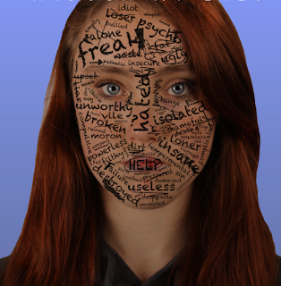
Amanda: This is our final finished film poster. We are very pleased with it. We particularly like the gradient effect we used, as it almost represents her life slowly getting darker and less happy, just like the sequence to our trailer. We kept the white font of 'brain flower' from dafont.com to keep a strict uniform. We showed it to several people in our year (male and female), and this was some of their responses: 


  • "Wow, I love it! I would watch it!" - Emma Williams 
  • "Oh, that girl looks so sad, bless her!" - Jess Chick
  • "Poor girl, looks pretty good." - Filip Kamycki 
Ade: Despite our initial struggle with 'Photoshop' we completed our poster and we are pleased by the outcome of the finished and final thing. Aspects which enhance the poster are the title, the tagline, credits and main actual picture.


The main picture illustrated our creativity, and our skills using Photoshop. We did not merely take a plain picture and placed it onto the poster. Instead, we intelligently altered the image so that it represented and reflected something within the film without revealing too much of the story line. 


Our Credits were also professional, as we used a variation of font size and included important information about about our film and the people who participated in the making of the film.  To make our film poster modern and to promote our film we included websites  that our film is associated with. 


Our Tagline is also significant and we were pleased with its outcome. The tagline not only reflects the content of the film but similar to most film posters, is an appropriate font size. The background colour of our overall film poster is blue; this is good because it doesn't marginalise our target audience to only a female audience but cuts across to a range; of females and males. We were really pleased with the feedback that we received from some of the people that we asked. 

Clare: Overall, our poster demonstrates the initial genre type of our film 'Through My Eyes', and is able to depict to our target audience the types of elements that the film may consist of e.g. bullying. We didn't want to oversimplify the context of our poster because we wanted the main focus to be on the protagonist and nothing else, so the close head shot illustration is there to grab the viewers attention. Our finished poster includes all the appropriate elements of a film poster that we researched prior to our editing process e.g. the tagline, credits etc. This improves the professionalism of our final outcome and is therefore a success.

Clare: I also decided to enhance the lightness of the eyes as a final editing technique, using the dodge tool to brighten them. This made her eyes pop to draw in the attention of our target audience. 

Film Poster Completed Tagline


Ade: Of all our tagline ideas, we've decided, the one 'A Journey To Regain Her Past' is very suitable for film poster and reflects the content within the actual film. 
Similar to most tagline's that influenced our film poster, our tagline is short and simple. This allows it to grab the audience's attention before evoking curiosity within the minds of potential audience.
The tagline, although short and simple is complex in a way. This is because it reflects the content of the film and vaguely hints that there is a chain of events which result to Anna's search of Anna's happiness. 

Amanda: We particularly like  the fact the tagline doesn't hint the drama element in the film. We didn't want to reveal to the audience of Anna's drug taking and her mother's alcoholism through the poster. 
Our tagline is in the same font (brain flower) as our credits in the trailer and our poster title. This was because we wanted to be professional and keep a continuous link throughout our work. Below, you can see our tagline. We made sure it was relatively bigger than the credits to show its importance, however, it is smaller than our title so the viewer knows that it in an insight into what our film is about.


Film Poster Final Credits


Amanda and Ade: These are our final credits. We stuck with the idea of monochrome colours, like the other posters we looked at. The only use of colour is on our production company logos. We did this because we wanted the three of them to stand out and be noticed. We, like the 'Darkness' poster that we found on google images, as mentioned before, because of the release date in bold lettering and the sizing of the credits. Continuity is something we've upheld as we kept some of the names we used within our coursework (it appears in the poster and the trailer). We made our credits more professional and modern by including different websites and linking our film to social networking sites as we understand that its a a good way of appealing and promoting our films to a wider audience. 


We also used a variation of text sizes to make our credits look more realistic and used a clear font 'Arial' from photoshop. We initially used the 'charcoal' font but then realised that it wasn't as clear as the 'Arial' font. Most film poster credits, like the end screen credits in our trailer, use a bold and simple font like 'Arial' or 'Times New Roman'. This is strict and professional. We want our work to look as professional as possible.
Film Poster Completed Title


Ade: Below, is our finished and completed title, that we placed onto our poster ( at the top). To make our poster professional, we allowed the element of continuity to remain. This is why we used the same type of font from our film credits; the 'brainflower' font from 'dafont'. 
We initially used a black fill for our title, however, we soon realised that it wasn't visible as it blended into the character's hair. 
We went through the similar, process that we used to make our credits. We used 'photoshop' to alter the colour and size. 


Amanda: We like the idea of the white font also to show the purity of Anna, and her innocence. The black words on her face present the evil, dark nature of the people calling her those names, contrasting with her innocent personality.


Clare: The original title that we edited was quite blurry, so we had to make adjustments and use the 'fill tool' to thicken the font size, otherwise it looked unprofessional. However, this was quickly resolved and improved the general look of our poster.

Film Poster Options


Amanda and Ade: Whilst creating our poster on photoshop, we started to get used to the different tools and other advanced  options that we could use to create our film poster; whilst doing so, we ended up with the two different posters in the above which we thought could be an option for us. We were intrigued by these two posters in the above, however, we preferred the blue one. This is because the fade element was less sinister than the black. The colours also don't attract only a female audience.

We felt that not including Anna's face and just having the words make it seem like she has no identity, other than the one people in school gave her. it's almost as if the bullying consumed all parts of her life, even her personality. The fact that Anna's face wasn't there is contrast to the insight into the character as we initially desired. We liked the simple yet abstract look of the poster. However, a few people said it represented a book cover and was plain.

Film Poster Editing Continued


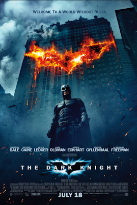
Amanda: We based our film credits on this particular poster. This was mainly because the credits were small and didn't divert from the main image. We also liked the use of monochrome colouring for the text to contrast with the background. The colour scheme was kept the same and also represented the dark, sinister element of the film, the red/orange fire represented the aspect of danger in the film. Saying this, we didn't like the fact that this poster contained the main actors names. We want our poster to be ambiguous and not reveal who is starring in it as we want an element of mystery. We particularly like the tagline as it gives the audience an insight into the film, yet doesn't tell them anything. We think that batman should have been photographed closer to make him seem even more powerful and intimidating. We want a close up of Anna so that there is no diversion of attention, like in this poster.


 Ade: To give us an in depth idea of how  realistic, professional credits appear within a film poster, we looked more into individual film credits. This one is very good. It includes all members who helped out but were not as prominent. The production companies are evident and in addition, others who were involved in the making. The credit also reveals members of the sound crew, make up and those who occupied the 'engineering' aspect of the film. What makes the credit most effective is the fact that the release date is made apparent-in large and bold writing, this is an aspect we hope to include in our poster as it is a significant part of manoeuvring an audience to watch our film.


Ade: This is another example of a good and effective credit, within a film poster. The variation of text size is enhanced. However, the text type was not as clear and readable as the one in the above, this is a flaw we intend to avoid when making our own. Furthermore, the use of production company logos were unprofessional and too playful within this credit unlike in the one above. We want to include the production company logos within our own poster as we see it as an important part of the poster. The release date is also vague within this poster. Whereas the credits above gives a specific release date '28 Jan', these credits merely says 'coming soon', this doesn't anticipate for the release of the film.

Film Poster Editing


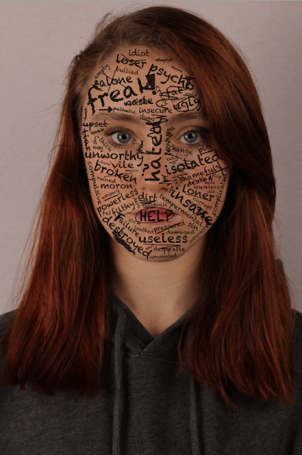
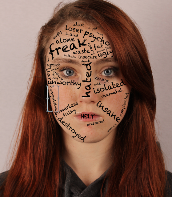
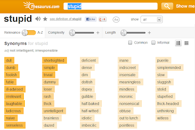
Clare: We have now started the editing process for our main film poster, having gained influence from other posters. We decided to stick to the idea of layering words and writing over our protagonist Anna's face, as we thought it was useful in depicting the sort of storyline our film has without giving too much away. We initially thought to physically write out the words and scan them onto the Mac to import to Photoshop and layer on top of the portrait image of Anna. However, this deemed too complicated for us and we came up with a simpler method whereby we typed up the words on Photoshop using a chalkboard style font to fit the theme of school/teenage life. So far, this process is succeeding and we really like the look of it. However, it is proving difficult to come up with unique words or phrases to add that relate to her situation, and has involved a lot of thinking and discussion as we have to make the individual words fit in certain areas. To help guide us through this process, we have used an online Thesaurus.


Amanda and Ade: We thought that Anna's face was too saturated in the picture. We wanted her to look paler and less lifeless, to represent the words on her face such as 'waste' and 'die'. For this we reduced the brightness and contrast on Anna's face to create the desired effect. This made Anna's face look darker, more mysterious, but not evil. We didn't want to make the poster too dark as it could be confused with a horror poster (for example 'The Number 23' poster). Also doing this made the words stand out much more and seem very overpowering. We want to suggest to the audience her life is consumer by these words, and what they mean. The word 'HELP' is in capital letters covering her mouth. This shows her asking for help, but not physically being able to open her mouth to say it. 

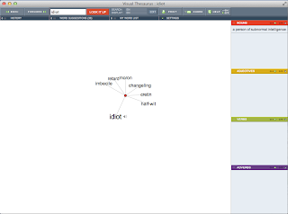
 After a while we were running out of words to use. We used the website visualthesaurus.con to help inspire use for more destructive words. We first looked for the word 'idiot' as we didn't want to use it twice. not many options came up that we thought were snappy enough.


For the word 'insane', there were many results that we liked. However, some were too cruel or didn't sound right. For example, the word bezerk didn't sound right, as if something teenage girls would use to bully a peer with. However, the word 'lunatic', we thought, was very harsh and not a nice term, too nasty to be displayed on our poster. We realised that young people may walk past the poster in the street, hence why we didn't want cruel words that children could pick up.


We used the pencil tool in Adobe Photoshop to create school like scribbles on her face. However, the finished product looked very messy and unprofessional. it looked like a 3 year olds scribble. We wanted more small, concise scribbles in particular areas, as if it were a doodle. this is our progress of more precise scribbles. We want the words to stand out more than the doodles do. We made the opacity of the doodle 75% so that they were lighter than the words, looking more like an HB pencil that is commonly used in many schools. 


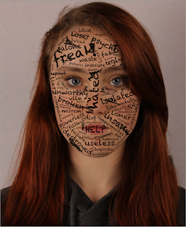
Clare: Above is the updated version of our film poster, after finishing the small doodles that surround the writing. We have decided to add scribbles to emphasise the anger within Anna's situation, as if she has taken it out on a picture of her own face. We have also underlined certain words with the pencil tool and crossed some out to create a bit of a pattern around the words. We added an exclamation point and an arrow in the style of a doodle a teenager would carry out in school and to inform the audience the age group of the main characters. We have also decided it would be a good idea to circle certain words for example HELP, because it is quite a strong word and we had previously placed it on her mouth to suggest she wants to say it but can't, and her character feels trapped. Prior to this adapted version, the scribbles we had created all over Anna's face just made the poster look messy, so this change was beneficial for the overall look. We also remembered to add the scribble effect in a new layer and not do it straight onto our background/original photograph. If we had done this, it would have caused problems because it would have been very difficult to undo to the original photo with just the words (also made in new layers) 
if we didn't like it which we previously didn't before we made new changes.

Clare: We then decided that it would be a good idea to stick with a previous design we created in our initial ideas and remove the mouth of the character with the word HELP still remaining in place of where her mouth would originally be. This emphasises the idea that she would like to get help and speak her mind but she feels trapped and as if she can't say how she really feels. To remove the mouth, I duplicated the background layer and zoomed in really close to the mouth area. I then used the clone stamp tool to select areas around her mouth and copy them onto her lip area. I made sure to use a low opacity on the tool so that I could make the blend nice and natural looking. I did this until the mouth was completely removed.


Clare: The image to the right is the outcome of this editing. Since the mouth has been removed, it left a bit of space for more words to be added. So, I decided to add in the words 'druggy' and 'deranged' which were both yet to be added to the face. I also added a few more scribbles to stick to the theme. We have now finished the writing/drawing elements of our image, and we are moving onto the main title and credits that need to be added.

Tuesday, 3 December 2013

Film Poster Initial Ideas

Clare: We have started drawing out our initial ideas for our film poster. We have gained a lot of our inspiration by previously looking at various famous posters from films that inspired our main trailer e.g. Cyberbully and Trust. We have also previously carried out research into the main elements of a successful film poster so we know what to include when designing the layout of our poster. Below are some drawings in which I did to demonstrate the direction in which the design and layout of our film poster is heading.


Clare: The first design was inspired by a film poster we had previously seen for the film '23', which we also discussed on our 'Film Poster Influences' page. The main element in which we liked regarding that particular film poster was the scribbly writing that covered the man's face. We thought this was effective because it related back to the film with the same number repeatedly written in a messy style all over the cover. It also gave the poster creativity and made it unique so that an audience could easily recognise it. The original poster appeared quite dark because of the lighting, which is one factor we may change so that it appeals a lot more to our target audience and also doesn't give the wrong genre impression e.g. horror. The messy writing could be replaced with hurtful, and some meaningful words, linking to our main storyline where our protagonist experiences a great deal of bullying, and goes through many difficult situations relating back to her personal life. We also like the idea of keeping our poster simple with just Anna on display, so that it isn't too confusing or too much to look at. That way, it narrows it down to one character and keeps it clear who the main focus is meant to be.

Clare: This is another design that we thought of ourselves. Since I take Photography A-Level, I am used to the idea of composing elements together in a photograph, and I am also quite familiar with Photoshop which is highly beneficial when it comes to creating things such as this. I remembered that for my Photography exam I am focusing on the work of an artist called Giuseppe Mastromatteo who is known for producing strange works of art such as the image shown to the right, which is where we gained the main inspiration for this pose with the eyes layered on top of the hands. The editing here puts emphasis on the women's eyes that have been layered so that they seep through her fingers, and we really liked the idea of this for our poster or even our magazine cover if we don't use it for our main poster. Something about it signals the 'Through My Eyes' phrase as we immediately focus on something that would usually be hidden since we are seeing through her and into her eyes. 


Ade: We understand the difficulties that may emerge during the process of making this poster, but we are familiar with the photoshop software and are open to experimenting to making the best possible image. This poster is also simple, yet complex. Although it is unconventional as a poster the fact that there are less words and less going on in the image makes it look artistic and meaningful; this is why if it's not used for our final film poster, may be used for our magazine cover.  


Clare: The final design shows a portrait image of Anna's character but without her mouth. We thought of this idea to emphasise the fact that Anna feels trapped and that she can't speak her mind. The idea of having a lot of words surrounding her without the mouth feature is also appealing to us because it's as if she feels she can't say anything to change the way things are. 

Ade:
Because most of the film posters we looked at had a single character dominating the full posters. This is what prompted us to use Anna to dominate the full poster. However, merely using her picture would make the poster seem empty and would not illustrate our skills with technology. So we thought that we could use 'Photoshop' and place words around her mouth and make the background a bit bright- not too bright that it doesn't reflect the sinister elements within the film, but bright enough so that it attracts our desired target audience of teens. We also thought it significant to include our production company logo onto the poster so that our film can be constantly associated with our logo and the audience can be familiar with it.

Amanda: We showed this design to several teachers and students, they said they liked the idea. However, it could be portrayed as a more violent film that it is through this poster idea. They also said it could be portrayed as if she has lost the ability to speak, when in fact, she hasn't. We have to consider this in our film poster, as we want to be mysterious but don't want to be misleading.