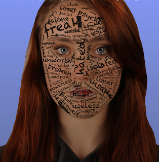
Amanda: This is our final finished film poster. We are very pleased with it. We particularly like the gradient effect we used, as it almost represents her life slowly getting darker and less happy, just like the sequence to our trailer. We kept the white font of 'brain flower' from dafont.com to keep a strict uniform. We showed it to several people in our year (male and female), and this was some of their responses:
- "Wow, I love it! I would watch it!" - Emma Williams
- "Oh, that girl looks so sad, bless her!" - Jess Chick
- "Poor girl, looks pretty good." - Filip Kamycki
Ade: Despite our initial struggle with 'Photoshop' we completed our poster and we are pleased by the outcome of the finished and final thing. Aspects which enhance the poster are the title, the tagline, credits and main actual picture.
The main picture illustrated our creativity, and our skills using Photoshop. We did not merely take a plain picture and placed it onto the poster. Instead, we intelligently altered the image so that it represented and reflected something within the film without revealing too much of the story line.

Our Credits were also professional, as we used a variation of font size and included important information about about our film and the people who participated in the making of the film. To make our film poster modern and to promote our film we included websites that our film is associated with.
Clare: Overall, our poster demonstrates the initial genre type of our film 'Through My Eyes', and is able to depict to our target audience the types of elements that the film may consist of e.g. bullying. We didn't want to oversimplify the context of our poster because we wanted the main focus to be on the protagonist and nothing else, so the close head shot illustration is there to grab the viewers attention. Our finished poster includes all the appropriate elements of a film poster that we researched prior to our editing process e.g. the tagline, credits etc. This improves the professionalism of our final outcome and is therefore a success.


No comments:
Post a Comment