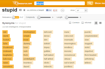
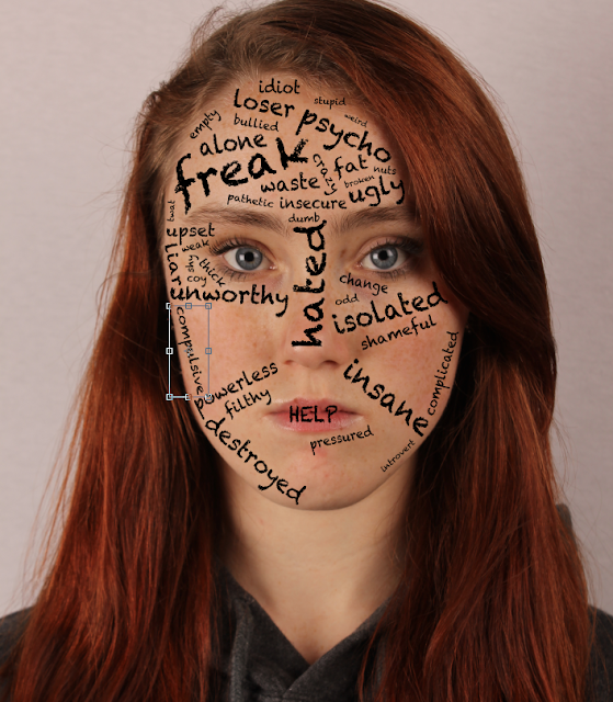
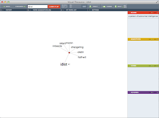
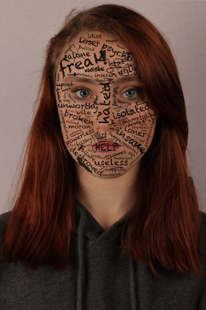
 Clare: We have now started the editing process for our main film poster, having gained influence from other posters. We decided to stick to the idea of layering words and writing over our protagonist Anna's face, as we thought it was useful in depicting the sort of storyline our film has without giving too much away. We initially thought to physically write out the words and scan them onto the Mac to import to Photoshop and layer on top of the portrait image of Anna. However, this deemed too complicated for us and we came up with a simpler method whereby we typed up the words on Photoshop using a chalkboard style font to fit the theme of school/teenage life. So far, this process is succeeding and we really like the look of it. However, it is proving difficult to come up with unique words or phrases to add that relate to her situation, and has involved a lot of thinking and discussion as we have to make the individual words fit in certain areas. To help guide us through this process, we have used an online Thesaurus.
 Amanda and Ade: We thought that Anna's face was too saturated in the picture. We wanted her to look paler and less lifeless, to represent the words on her face such as 'waste' and 'die'. For this we reduced the brightness and contrast on Anna's face to create the desired effect. This made Anna's face look darker, more mysterious, but not evil. We didn't want to make the poster too dark as it could be confused with a horror poster (for example 'The Number 23' poster). Also doing this made the words stand out much more and seem very overpowering. We want to suggest to the audience her life is consumer by these words, and what they mean. The word 'HELP' is in capital letters covering her mouth. This shows her asking for help, but not physically being able to open her mouth to say it.
  For the word 'insane', there were many results that we liked. However, some were too cruel or didn't sound right. For example, the word bezerk didn't sound right, as if something teenage girls would use to bully a peer with. However, the word 'lunatic', we thought, was very harsh and not a nice term, too nasty to be displayed on our poster. We realised that young people may walk past the poster in the street, hence why we didn't want cruel words that children could pick up.
We used the pencil tool in Adobe Photoshop to create school like scribbles on her face. However, the finished product looked very messy and unprofessional. it looked like a 3 year olds scribble. We wanted more small, concise scribbles in particular areas, as if it were a doodle. this is our progress of more precise scribbles. We want the words to stand out more than the doodles do. We made the opacity of the doodle 75% so that they were lighter than the words, looking more like an HB pencil that is commonly used in many schools.
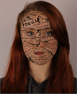
 Clare: Above is the updated version of our film poster, after finishing the small doodles that surround the writing. We have decided to add scribbles to emphasise the anger within Anna's situation, as if she has taken it out on a picture of her own face. We have also underlined certain words with the pencil tool and crossed some out to create a bit of a pattern around the words. We added an exclamation point and an arrow in the style of a doodle a teenager would carry out in school and to inform the audience the age group of the main characters. We have also decided it would be a good idea to circle certain words for example HELP, because it is quite a strong word and we had previously placed it on her mouth to suggest she wants to say it but can't, and her character feels trapped. Prior to this adapted version, the scribbles we had created all over Anna's face just made the poster look messy, so this change was beneficial for the overall look. We also remembered to add the scribble effect in a new layer and not do it straight onto our background/original photograph. If we had done this, it would have caused problems because it would have been very difficult to undo to the original photo with just the words (also made in new layers)
if we didn't like it which we previously didn't before we made new changes.
 Clare: We then decided that it would be a good idea to stick with a previous design we created in our initial ideas and remove the mouth of the character with the word HELP still remaining in place of where her mouth would originally be. This emphasises the idea that she would like to get help and speak her mind but she feels trapped and as if she can't say how she really feels. To remove the mouth, I duplicated the background layer and zoomed in really close to the mouth area. I then used the clone stamp tool to select areas around her mouth and copy them onto her lip area. I made sure to use a low opacity on the tool so that I could make the blend nice and natural looking. I did this until the mouth was completely removed.
Clare: The image to the right is the outcome of this editing. Since the mouth has been removed, it left a bit of space for more words to be added. So, I decided to add in the words 'druggy' and 'deranged' which were both yet to be added to the face. I also added a few more scribbles to stick to the theme. We have now finished the writing/drawing elements of our image, and we are moving onto the main title and credits that need to be added.

No comments:
Post a Comment