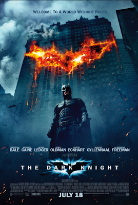
Ade: To give us an in depth idea of how realistic, professional credits appear within a film poster, we looked more into individual film credits. This one is very good. It includes all members who helped out but were not as prominent. The production companies are evident and in addition, others who were involved in the making. The credit also reveals members of the sound crew, make up and those who occupied the 'engineering' aspect of the film. What makes the credit most effective is the fact that the release date is made apparent-in large and bold writing, this is an aspect we hope to include in our poster as it is a significant part of manoeuvring an audience to watch our film.
Ade: This is another example of a good and effective credit, within a film poster. The variation of text size is enhanced. However, the text type was not as clear and readable as the one in the above, this is a flaw we intend to avoid when making our own. Furthermore, the use of production company logos were unprofessional and too playful within this credit unlike in the one above. We want to include the production company logos within our own poster as we see it as an important part of the poster. The release date is also vague within this poster. Whereas the credits above gives a specific release date '28 Jan', these credits merely says 'coming soon', this doesn't anticipate for the release of the film.


No comments:
Post a Comment