Ade and Amanda: We looked at the posters of the films we found had a great influence on our trailer. The poster 'Cyberbully' is simple yet powerful. In the poster, we see 'Taylor' sitting alone, looking at her laptop, with words surrounding her. It shoes the fact she feels isolated and is getting cyber bullied. However, we don't like the background colour, because it is bright and does not create a sombre emotion if you look at it. The laptop is the only prop, yet seems to be more powerful than the actress sitting there. Even though the audience can't see what the laptop says, we all know it will be harsh comments on a social networking site.
This poster for the film 'Bullying' is effective. Similar to other film posters, this one has a key figure who stands in the middle. This gives an insight into the character, isolated and alone. The poster also has a dark background effectively reflecting the grim, harsh storyline that may emerge within the film. The light at the end of the tunnel gives is ambiguous as it may symbolise a possible 'death' or suicide, though it may also mean that everything may be resolved and the light signifies good. The only flaw this film has is the character is too much of a dark figure and not exposed as much. It almost presents the film as an horror.
We decided we don't like this poster for several reasons. There are too many people on the poster, drawing attention away from the main character. the film is about a young girl getting raped. However, from this poster is seems like the child is hiding from the two people above (who are actually her parents). The parents are portrayed to be evil in this poster. Saying this, we like the font used as it seems like a computer.
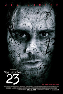
Clare: This poster is effective as it displays a portrait of a character alone with their face taking up the majority of the cover, therefore we are aware they are the protagonist and it draws attention to the fact that they are an important character in this film. We liked the layout of this poster in particular because of the layering style with the writing all over the man's face. We thought that this would be a great idea to use for our own poster because we particularly liked the scribbled, messy element in which we could include hurtful bullying words such as 'stupid girl' etc. The lighting of the photograph is also effective here because of the black border which leads your eyes to the character's face and draws you into the image. However, this may look a bit too dark for our genre, so we could adjust the lighting level and make it a bit brighter to appeal to a younger audience and make clear of the genre.


No comments:
Post a Comment